No edit summary |
No edit summary |
||
| Line 2: | Line 2: | ||
<!-- Please put your content under this line. Be sure to sign your edits with four tildes ~~~~ --> |
<!-- Please put your content under this line. Be sure to sign your edits with four tildes ~~~~ --> |
||
| + | |||
| + | I've got couple of sketches for a logo on my table, but had no time to get back to them... will happen this year - promise! |
||
| + | |||
| + | (writing at 2am...) |
||
| + | |||
| + | [rava] |
||
| + | |||
| + | ---- |
||
| + | |||
Update (2007-11-17 c.e.): |
Update (2007-11-17 c.e.): |
||
Revision as of 00:46, 30 November 2007
I've got couple of sketches for a logo on my table, but had no time to get back to them... will happen this year - promise!
(writing at 2am...)
[rava]
Update (2007-11-17 c.e.):
Rumor has it that some people are getting antsy for this logo contest to end. :-) To tell the truth, I was hoping there'd be lots more of you graphic-artists out there just chomping at the bit to marvel us with your stunning submissions. Like five entries is not a huge number of them, ya know? I like some of the ideas so far but I don't think I'm the one to vote on it and choose, and I'm not sure how to hold an open vote by all contributors/viewers. I kind of thought that since CHDK is GrAnd's main effort (and even his suggestion to get some logo submissions), he might be the one to finally say, "I like that one! I'll use it." Or, "Screw them all! My original one is still best!" :-)
(plus I don't know how to change the logo and I probably don't have the user permits for it)
So .... I'm kinda thinking that ... maybe this page should just stay up and let it run? Then there's always a place for people to submit possible logos. That way if at any time GrAnd likes one of them, he can just go ahead and grab one. Or swap it out for another if something else catches his eye?
Maybe a link titled "Logo Submissions" could just be added to the Feedback section on the main page and the "contest" in the News section finally moved off. Then anytime someone could submit a new idea. One will eventually stick. Even Coke changed their logo over the years. Surely we have at least that much freedom. :-)
[mr. anon]
Have not been here for a while - so I was quite astonished (and honoured of course) to see my (draft of a) logo made it to the top of the page (and at least to two fora.) Since I was asked: I explicitly permit the use of the unaltered logo(s) for every non-commercial purpose concerning CHDK. Feel free to suggest improvements or modifications. [cosmograph]
- Well, maybe it's just my monitor, the dark grays to black on it are stronlgy bunched up on that end. Making it very difficult to see the words on the dark-gray dial. Might be nice if the letters on the CHDK dial were more legible. And as you can see, I always like purty colors on the ones I sent for examples. :-) I did borrow your logo today and brightened it up some just to see what would happen, but didn't take the time to upload them. (one of course has lots of purty colors on it. I know, uck)
- Congrats on winning btw! But don't get too comfortable on that throne, I might finally come up with something by spring that I think is worth sending as an official submission. :-) [mr. anon]
As suggested two brighter versions:

[cosmograph]
- I'd like to see the picture even more brighter. Because the current variant looks good on LCD monitors with (S)IPS panels, but is still hardly readable on PVA/MVA panels due to these panels less readable in dark colors. As I do not have the original image I've tried to change your one by raising brightness of the dial area (so, the quality is little bit degraded):


[???]
- Ah, that's MUCH more better! Thanks! Looks nice here!
- But I had a momentary lapse of I need lotsa colors, so I came up with this'n, playing off of your camera-dial idea (again). ... :)

- I know, I know, you folks are crazy about that red and black/gray stuff, so I at least made the main logo letters in those colors. :) It might look a little tacky compared to yours, but if anyone wants to expound on this, I saved the bare-bones vectors in a file so I can flip colors and bevels and things around. (And I wanted to figure out how to use all those cool layout tools I've never used before. :) Okay, I'll quit butting in after this, I promise. :X
GrAnd suggested that people submit some ideas for logos, the only requirement is they have to fit a 266x75 format for Wikia's Quartz skin, or 135x155 for all other skins, 155x155 may be used but not recommended (* see GrAnd's note below). It's probably good to also keep them limited to a PNG filetype so you can upload them to the Wikia and make them easier to view and use.
Share them here or in the discussion section (link above). Some samples were posted there for a starter.
How to upload a picture (See also) You have to be logged in do do it though by signing up to have an account.
Anyway, I was fooling around with my PL32 editor and came up with this. It's not really good. As I said I was just fooling around playing with some of PL32's editing tools. But I thought it might act as an example for others, maybe of what NOT to do. :-)
![]()
I thought taking elements from different parts of CHDK features might be made into one somehow. Surely this can inspire anyone to do better. :-) This one covered the on-screen-display elements like the histograms (OSD), scripting (motion detection and intervalometer lightning photography), the fun of the built-in games, and the customizable Grid feature.
[mr. anon]
(hmm... when uploading wikia thew some pixels in new places, oh well, it's just an example)
- Thanks.
- Actually, wiki uses two different logos depending on skin used. :) From wiki-help:
- The logo for the Quartz skin has to be no more than 266 pixels wide and 75 pixels tall, and should be saved in the .png format.
- The logo size for all other skins has to be no more than 135 pixels wide and 155 pixels tall, and should be saved in the .png format.
- But, the second one can be 155x155, although 135x155 is recommended. --GrAnd 07:02, 17 October 2007 (UTC)
- Thanks for the clarification GrAnd, It helps to give folks a few more formats to fit their layout into. I'll leave mine as-is and re-do it if ever needed, but it's just an example. :-) [mr. anon]
LOGOS
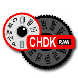
Tried to visualize CHDK as enhancement of a jog-dial resembling the orginal one.
![]()
[cosmograph]
- Hmm... I like this idea! But I think it might be nicer if CHDK was a little logo right on the dial, maybe even shown at an odd angle so it's not obvious at first, then with one of those image-insert blowups like in a user manual, pointing to it and showing it enlarged. You might like to have it be CHDK (+RAW), since RAW is such a small subset of its many functions. RAW just don't tell the story and so many other cameras already have RAW, missing the impact of how special it is. CHDK is more like having a whole extra dial on the camera. :-) I like the concept though. This is the problem I had, trying to convey all that's in CHDK in a simple logo. I almost thought of using a swiss-army knife theme. With each blade, corkscrew, scissors, etc. labeled for one of its functions. Then I was back to "too complex" for a simple and easy to recognize logo. Anyway, nice idea! Too bad a logo can't be an animated GIF or SWF, then we could have it like a transformers-cartoon animation, a simple camera falling into bits and reassembling itself into some mighty super-robot camera. We'll eventually need a CHDK super-hero character out of this, he comes along and saves us from all those paltry camera-company offerings. :-) [mr. anon]
Second version without any visual reference to the features of CHDK.(I fully agree that CHDK is more than RAW).

- Hmm... I remember seeing an earlier one, where you did 2 dials, one with CHDK's features listed on it. I think I liked that better, but was going to suggest making the dial-sectors of CHDK's options into brighter colors, and making the original camera's mode-dial the dim one. I'm not the one that's going to be voting on these things, but I did like that concept better. What if you did the above, but just with CHDK features listed in colorful sectors? Forget about the camera's mode-dial options. It's been REPLACED!! :-)
- [mr. anon]
- I was thinking more along the lines of something like this, if it could be made more legible.

combination of a typical canon and the text, just n idea, no time to try different fonts http://free.pages.at/panther06/chdk-logo22-s.jpg
so - if you like the idea, but don't like the font, go on and do what you want with the clean cam
[1]
[2]
So I decided to give something back. I actually made three but this one I like the most.